All Alone In The Night
Frequently Asked Questions
What is the music?
The song is called Freedom Fighters by Two Steps From Hell.
It was featured in the third trailer for Star Trek (2009).
What locations are visible in the video?
The sequences are:
- (0:00) North-to-south down the western coast of North and South America.
- (0:48) North-to-south over Florida, the Bahamas and other Caribbean islands.
- (0:56) South-East Asia, approaching the Philippine Sea
- (1:04) Western Europe, from France through Italy, Greece, Turkey and the Middle East.
- (1:20) Aurora Australis, over the Indian Ocean, approaching Australia
- (1:36) Aurora Australis, over the Indian Ocean.
- (1:52) Aurora Australis, unknown location in the Southern Hemisphere.
How much is this sped up?
The original sequences in the video were shot with each frame between 1 and 3 seconds apart. I slow down the sequences to about twice their original lengths. As a result, 1 second of the video is about 15 seconds of real time.
What software was used to make it?
There were three main steps for this project.
- Downloading the individual high-resolution photos from NASA.
- Combining the sequences into a video file.
- Editing the sequences into the final video.
For Stage 1, it was a combination of custom bash scripts to download and request the high-resolution images, and an FTP client to download them from NASA.
For Stage 2, I used an app from the Mac App Store called Time-Lapse to compile each of the sequences into a single video.
For Stage 3, I used Final Cut Pro X. In particular, I used the ‘Optical Flow’ option for slowing down the sequences to about half their original speed. This helped smooth the journey, but resulted in some interesting ‘ripple’ artifacts.
Can you really see curvature from the ISS?
The ISS’s altitude isn’t high enough to see the full curve of the earth. However, it can see a reasonably large segment of the earth, enough to see a curve on that segment. Here are some scale diagrams to help illustrate it:
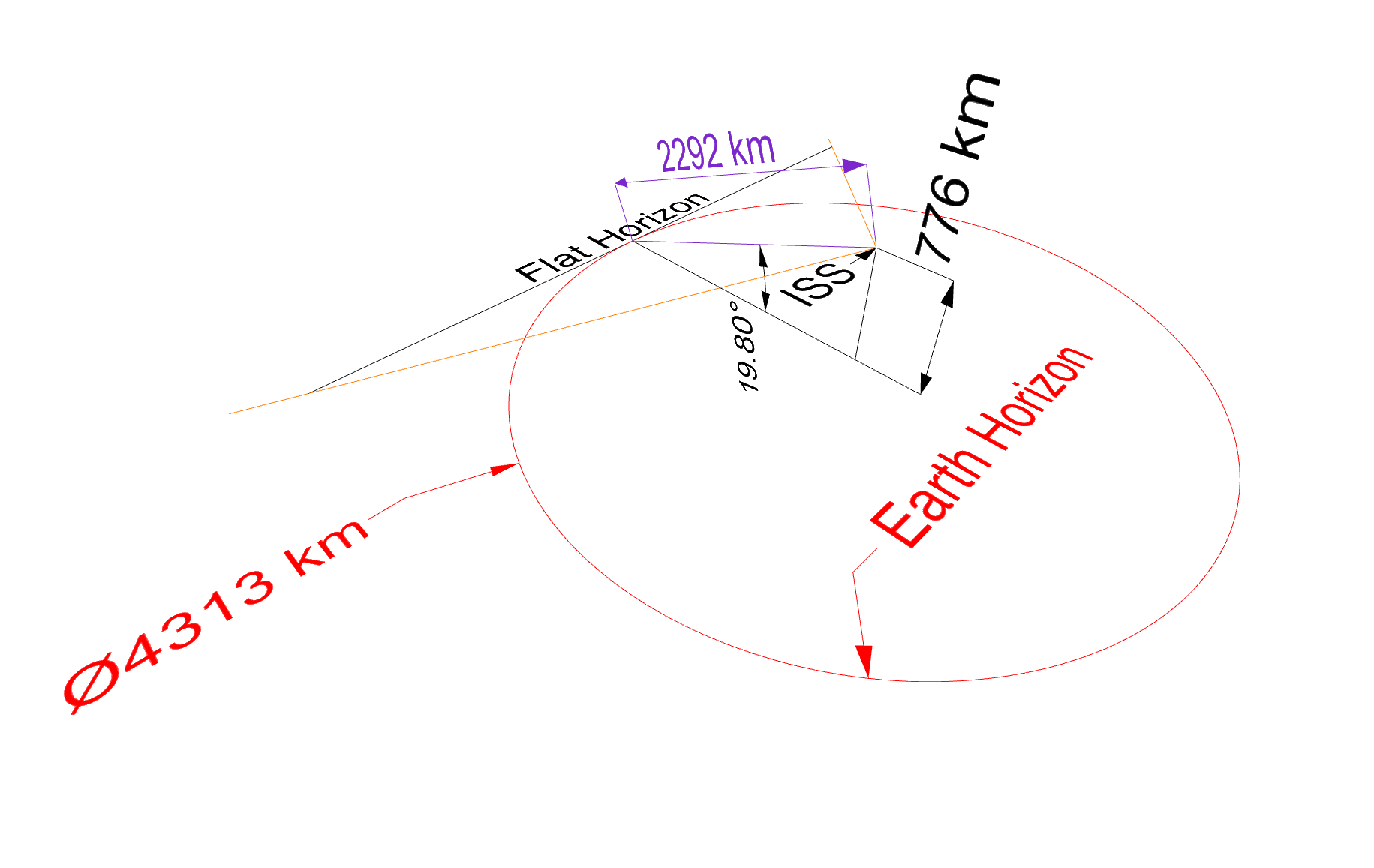
Firstly, here is a scale diagram of the earth and the ISS (click to zoom in):

Credit: David Peterson & Andrew Peterson
The red line is the visible horizon from the ISS at an altitude of 400 km.
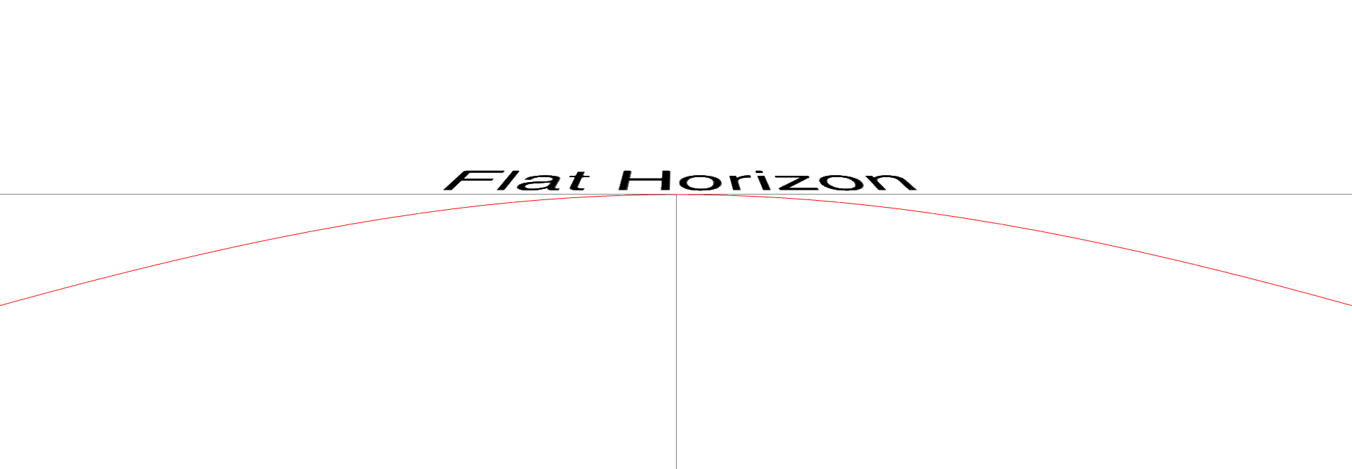
Next, here is an overhead view, looking down towards the ISS, with the red circle being the visible horizon from the ISS:

Credit: David Peterson & Andrew Peterson
The red circle is the horizon, the same as the red line in the first diagram, looking down from 90º. The black “Flat Horizon” is a tangent to the Earth’s horizon, and is what would be visible as a straight line when looking at the horizon from the ISS. The orange lines indicate a field of view of 100º when using a 15 mm lens on a 35mm sensor, as was the case for most of these sequences.
Here are the same details, from an off-centre perspective:
Credit: David Peterson & Andrew Peterson
And here is the view you get from the ISS, looking directly at the horizon, with a field of view of 100º, which is what is present on a 15 mm lens:
Credit: David Peterson & Andrew Peterson
And an actual photo from the ISS, taken with a 15 mm lens on a Nikon D3S, for comparison:
Credit: NASA
How do you calculate the curvature?
So, here is the math, if you want to dive in.
There are a few steps we need to take to figure this out mathematically. Here is what we know at the beginning:
- The radius of the Earth (R): 6,367 km
- The altitude of the ISS (h): 400 km
Both the radius of the earth and the altitude of the ISS vary slightly depending on where you are. These numbers fit within the range.
Now, we calculate the distance to the horizon using this rule: the tangent between any point and a single point of a circle will be perpendicular to the centre of the circle. That point of tangency is our horizon, and we can calculate it using Pythagora’s classic theorum:
In our case A is the Earth’s radius (R), and B is the distance from the ISS to the horizon (d), and C is the distance from the ISS to the centre of the Earth (h):
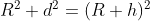

So, we have a new value:
- The distance from the ISS to the horizon (d): 2,292 km
We can now calculate the angle between the d and the horizon line (z) (in red in the diagram):

- The angle between the ISS and the horizon line (z): 19.8º
Now, we can calculate the radius of the horizon line (a) and the distance between the ISS and the horizon line (o) like so:


- The radius of the horizon line (a): 2,156.6 km
- The perpendicular distance from the ISS to the horizon line (o): 776.3 km
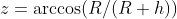
Can I create a scale model of the curvature?
Knowing the radius of the horizon line and the distance of the ISS to that line means we can easily create a scale model on Earth.
If we divide the radius o by the ISS distance a, we get a ratio y for viewing height to the horizon radius:

We can now apply this to creating a flat circle of an appropriate scale to your eye level:

For example, if your eye level is at 6’, you can set up a circle on the ground like so:
Credit: David Peterson & Andrew Peterson
When you stand in the centre of the circle and look at the horizon, you can see the curve of the horizon at roughly the same perspective as on the ISS.
Is this CGI?
All the sequences in the video are real photographs taken with a decent stills camera (typically a Nikon) with long exposure time. The only thing special about them is they are taken from a space station orbiting the Earth.
What’s with the rippling effect?
The original time-lapse sequences whip by pretty quickly, so I slowed them down in Final Cut Pro X using the ‘Optical Flow’ method. From the Apple website:
“Optical Flow: Adds in-between frames using an optical flow algorithm, which analyzes the clip to determine the directional movement of pixels and then draws portions of the new frames based on the optical flow analysis.”
Because the movement of pixels is quite rapid toward the bottom of the frame, the analysis has trouble tracking it, especially when it encounters a fixed object like the frame of the ISS. As such, you get some ‘rippling’ or ‘warping’ of the image in those areas.
Why don’t the clouds move?
Since this is a time-lapse, one might expect to see the clouds moving throughout the video. After all, we can see clouds moving from Earth in real time.
However, the ISS is a lot further away from the cloud layer than we are, and that distance changes how much movement is visible.
Cumulonimbus, or storm clouds, are at most 13 km above us. The ISS is between 409 km and 416 km above us, so let’s say it is 400 km away from the cloud layer.
Let’s imagine we are taking two square photos of the same clouds at the same moment in time with the same type of camera - one from earth looking straight up, the other from the ISS directly above it looking straight down.
This will give us two pyramids, with the point being the camera, and the base being the cloud layer. Something like this:

Credit: David Peterson
If we calculate the dimensions of the bases, we can determine how much cloud area each photo will cover.
A typical 50 mm lens on a 35 mm sensor will have a field of view of about 46°. If we divide the pyramid in two we get two right-angled triangles, so we can use some Pythagorean geometry to calculate the area of the base. Here is the formula:
(tan(26) x h x 2)2 = area of the base
When we plug in 13 km for the Earth-bound photo, we get an area of 122 km2, or an 11 km x 11 km square.
From the ISS at 400 km, we get an area of 115,315 km2, or 340 km x 340 km of visible clouds.
That gives us a ratio of 967:1 between the areas covered by the two photos. Here is what that would look like:

Credit: David Peterson
The blue is the area covered by the photo from the ISS. The red is the area covered by the photo from Earth. You will understandably lose a lot of detail.
Not only that, but given the speed of the ISS, a full orbit takes 90 minutes travelling at 7.66 km/s. As such it would take only 44 seconds for something to appear on one edge of the photo and disappear off the other edge.
All those things combined mean you don’t see much change in clouds from the ISS.
Why are the lights so bright?
If you were looking out the window of the ISS yourself, they would not be so intense.
The photos were taken with a long exposure (about 1-3 seconds per photo, depending on the sequence), which allows the camera to capture more light.
Additionally, the contrast and saturation were boosted to help them pop a bit more in the video.
Why can’t I see city lights in the ISS Live Stream?
The ISS has several high-definition cameras which send a live stream with views of Earth. It provides great views during the day, but at night it is basically black.
The cameras, like everything on the ISS, is an experiment that happens to have a nice side-effect for us here on the surface. But the goal of the expiriment is to test how commercial-level cameras function in space.
According to Chuck Claunch, who helped build the system, the settings are left on settings for daylight exposure so that “dead pixels” are easier to spot when it’s black at night. As such, you won’t see much from the live stream when it’s on the night side of the Earth.
These videos, on the other hand, are composed from multiple photographs taken cameras set to capture as much light as possible with at least 1 second of exposure. This gives us images that are much brighter than they would be even to to the naked eye.
Why don’t we see a full orbit of the Earth?
It’s a technical reason basically. To capture as much light as possible at night, the camera is set to a long shutter speed and a wider open aperture. When the sun comes up, it is over-exposed and just becomes white-hot.
Here’s one of the original still frames from the end of the first sequence in this video:
Credit: NASA
Why not let the exposure adjust automatically? It’s possible, but it results in flickering frames, because the camera adjusts constantly. It’s hypothetically possible to shoot night-to-day time-lapses, but it’s complicated and time-consuming. These ones were all done pretty simply.
If you want to see some daylight sequences, you can find some in my other video, The World Outside My Window.
What are the blue flashes?
The blue flashes you see in the first sequence are lightning.
Why do flashes last so long?
If you slow down the video, you will notice that the lightning flashes appear for 2 or 3 frames at times. A time-lapse will only capture a single flash for a single frame.
However, to make the sequences last longer, they were slowed down to about 50%. As such, each frame from the original time-lapse lasts about 2 frames in this video. The video editing software created extra frames to fill in the gaps, so flashes get stretched across a couple of frames.
You can see another version of the sequence here which is at full speed. I preferred it a bit slower.
Is lightning really visible from space?
The individual frames are shot with a long exposure, with 1 photo every second, so the camera is able to capture light over more time. That increases the odds of seeing lightning in the sequences.
What’s with the green city lights?
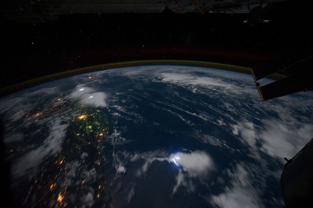
Credit: NASA
Most of the lights on the ground have a yellow hue. But at 0:30, there is a patch of city lights that looks green.
It turns out that this is the country of Guatemala. In 2009, the government planned to replace street lighting with environmentally-friendly LED lamps. As indicated in this discussion it seems they had made some progress by 2011 when this sequence was recorded.
What’s with the green glow on the horizon?
It is called airglow.
What’s with the rippling green lights?
That is the aurora. It occurrs around the poles, due to solar material mixing with our magnetic field and atmosphere. In this case, it is the Aurora Australis, captured near the South Pole.
Are there any satellites in the video?
Satellites can be hard to spot by humans in space, but occasionally the camera does pick them up. You can see one in this video around the middle of the screen at 0:47.
You will notice that it appears just as the sun is beginning to rise in both this video and the one here. The light from the sun, at that angle, makes them easier to spot at that time.
Where are all the satellites?
Here is an image from the European Space Agency depicting how satellites are dispersed around the Earth, circa 2009:
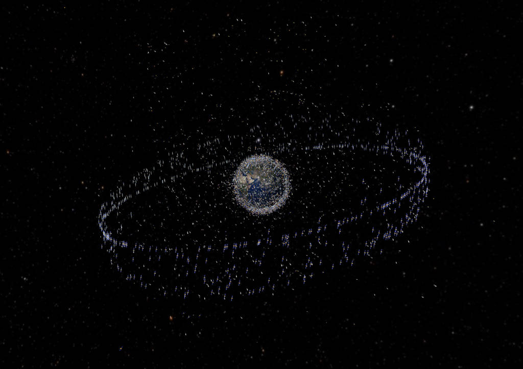
So many satellites! Why can’t we see any in the video?
Keep in mind that the image above is not to scale. The satellites depicted are huge compared to reality. Even if they were a single pixel they would still be gigantic.
Let’s do some math and figure out how much distance will actually be between satellites on average.
According to the UN Office for Outer Space Affairs (yes, this department actually exists!), about 6353 satellites are in low Earth orbit (an altitude of 180 km to 2,000 km) as of June 12, 2021.
Earth has a circumference of about 40,000 km. If all 6353 satellites were lined up around the equator at the same altitude, there would be one every 6.2 km.
However, they are dispersed all around the planet in a range of different orbits. The Earth has a radius of about 6367 km. Add 400 km for the altitude of the ISS and you get 6767 km. Given the formula for calculating the surface area of a sphere is 4 x π x r2, that gives us a surface area of 509,424,190 km2. Divide that by 3056 and you get 1 satellite in every 80,186 km2, or every 283 km by 283 km square, if you prefer to think of it that way.
That’s a lot of empty space.
Satellites do exist, and the ISS has to plan its orbit to generally keep out of the way of any known hazards, but it is not exactly a traffic jam up there.
Is the Earth is pear-shaped?
In one of his many ‘mythbuster’ interviews, Neil DeGrasse Tyson mentions that the Earth is technically not a perfect sphere, but rather an ‘oblate spheroid’ and is in fact ‘pear-shaped’. Here is the video:
Credit: fiveredpears/YouTube
This is true. However, some construe this to mean that the Earth will look like an actual pear. If you watch the whole interview he clearly says that at a cosmic level, the Earth is practically a perfect sphere.
As indicated in this article, the diameter is 12,756 km at the equator and 12,713 km at the poles. That gives us a difference of 43 km. In percentage terms, the diameter is only 0.34% bigger at the equator - about 1/3 of 1%.
If the Earth was the size of a marble, we could barely detect mountains and oceans with our finger, let alone a slight bulge of less than 1%.